ShopDreamUp AI ArtDreamUp
Deviation Actions
Little Archychy's Street Performer's Jar
If you appreciate what I do, the little contributions will help me pay for the 'core membership,' and it will also serve as an extra motivation to keep going.
Thank you in advance. 😊
$1/month


Suggested Deviants


Suggested Collections


You Might Like…


Featured in Groups

Description
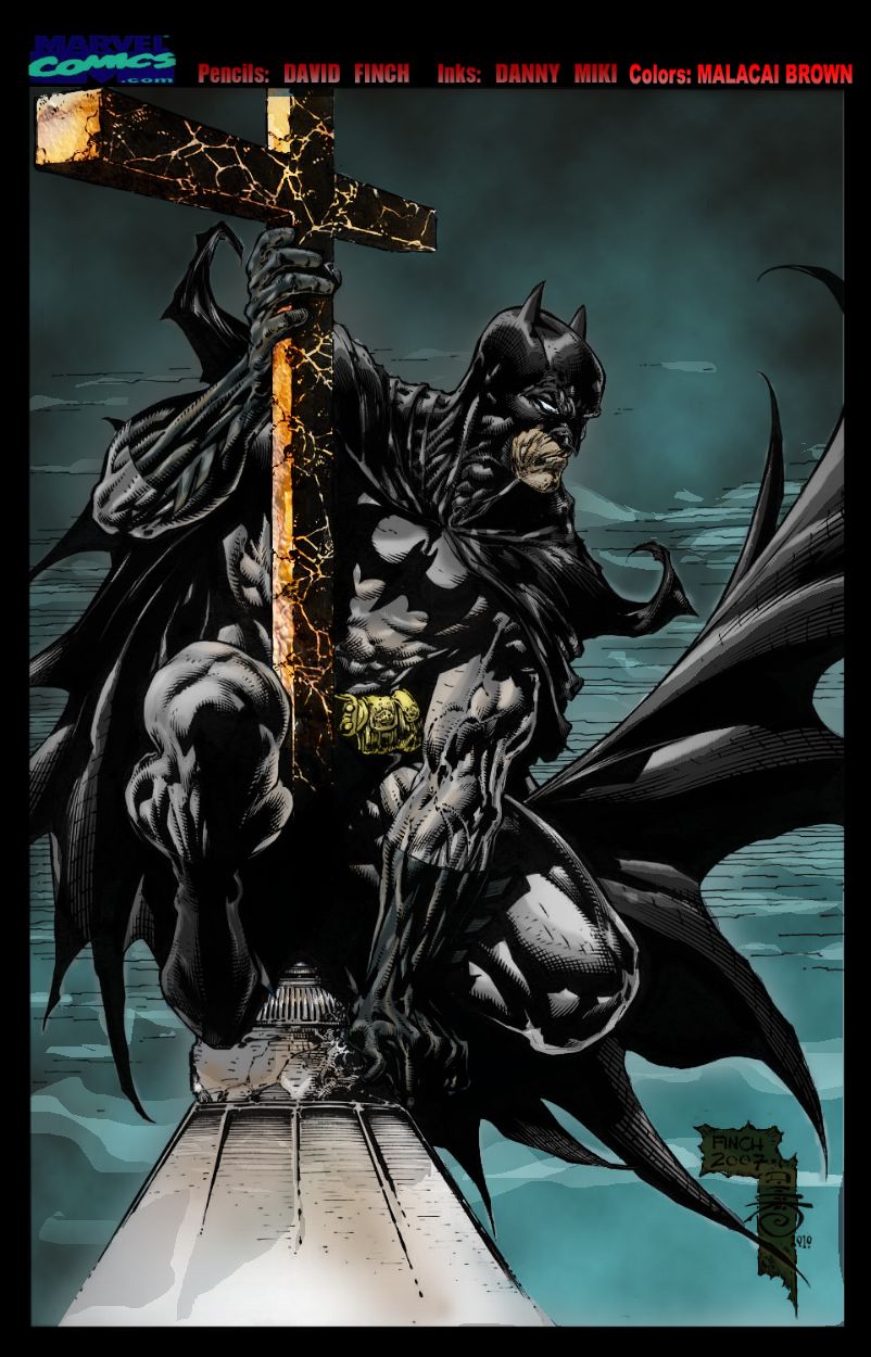
Here is another color job I did today. Hope everyone enjoys the splash of color. Still trying my hand at getting better with this color thing.
Pencils: David Finch
Colors: Malacai Brown
Pencils: David Finch
Colors: Malacai Brown
Image size
802x1250px 162.47 KB
© 2012 - 2024 Art-Of-Malacai-Brown
Comments19
Join the community to add your comment. Already a deviant? Log In
Because you didn't do pencils, I'm not going to comment on those. There are a couple of structural things the penciller did that distract from the subject (like moving Batman's face at an odd angle. Yeesh.) Eh, it's all style, right?
Coloring is what you did, so that's what I'm going to focus on. I ASSUME you worked on the computer, so I'm going to speak as if you did.
The way you shaded Batman's head looks funny. I know you didn't ink either, but there's something so odd in the slope of his forehead and especially his right eye which seems to jut off his face more so than his cheekbone...It's just odd. I'd have snuck a little portion of grey to round it out so he doesn't have the odd, vaguely dangling glare he has now. :/
You have a similar problem I have on textures. What texture is Batman's suit? Are you giving him something stiff or something that almost adheres to his body in a rubbery kind of way? Is it slick or, as I said, rubbery? That really helps with the way you color his suit. If I remember correctly, the grey parts are almost the rubbery substance but the gloves and boots are almost specularized-shiny. You could've taken both to the next level.
You have a wonderful texture on the tip of the cross-beam of the cross that I wish you'd taken further along the edge at the top. You have it all the way through until the eye reaches the top where it's simply yellow with a little hint of orange at the bottom. You have to be careful with high rendering in that if you don't follow through, the eye notices and it leaves a sort of dissonance in the work.
The cape is...well, no fabric is shaded like that. You needed to blend out those colors more in order to make it look more realistic. (Again with that hyper-rendering.) The edges of the shadows are just much too much hard. Be careful with the inker's notes as well. There's a crease near the Batman's thigh on the right that had a really big black indent which you then followed with the lightest grey possible. Real fabric would never reach that color that fast, not even a flag, from that deep a shadow.
More texture was needed on that little cupola he's sitting on. The uttermost left side looks flat, which is a shame because the rest is rendered in 3D with the coloring you added.
Your sky, too, is gorgeously rendered at the top. In an effort to keep with the inker's lines, though, you added lined clouds. You could've softened the edges, which would be one way, or kept that watercolor-like blotting throughout adding incredibly softened highlights downwards. But taking us from that gorgeous visual texture into something more cartoony is very jarring.
In another style, I wouldn't have had these criticisms to make. Your coloring style is perfectly good and very emotive. I actually really, really like it. Unfortunately, the penciller and the inker made everything incredibly hyper-realistic (except for that head. What happened to that head?) so you have to follow suit with the coloring - and you do, for the most part. I would recommend really, really studying textures and the way they affect colors (ESPECIALLY fabrics!). It's annoying. It's tedious. It is unfortunately necessary for something like this.
The only other thing I have to talk about is your color choice. Because it's Batman, you can play it up. Over-dramatize a little, if you will; he and the Gotham he inhabits lend themselves to that style of color. Make that sky a little darker, make that cupola a little whiter (well, within reason). Push the boundaries.
But the colors you choose are...hm. Let's use the yellows for example. You have a rich, very saturated almost goldenrod yellow for that cross...and then a low-saturation canary yellow for his tool belt. It clashes. It would be more harmonious to take a smiliar yellow from the cross to use it on the belt (though you could tint or shade it to your heart's content). The orange used for the burnish looks like the shade used on the cupola - which is great! It ties that together. Using a very soft, not-really-there color on Batman's grey suit (like a lavendar that's so faded out it only appears as the base, it's not even really there) and then using purple in the sky would help make blend that in as well. If you don't like that option, make the sky the kind of purple that is the golden yellow's complement to really make a contrast. Play with it, but make sure it ties in.
One other comment: Batman's flesh. Unfortunately, the value that you gave Batman's flesh is the same exact value as the sky behind him. He becomes...unnoticed there. His cowl and cape step out, but unfortunately his face has to step out with them. One way to make his face noticeable, as the penciller and inker intended from leaving you that space, would be to take a similiar yellow like the golden yellow and subtly add a wash over the face. I don't know many other ways, but I'm sure you could think of a few. The viewer needs to focus on Batman. Using color, you have to bring them there.
You bring good emotion and wonderful technique to this. I just think you have to really follow the other artist's leads and take it up one more notch.
Be proud of your work! <img src="e.deviantart.net/emoticons/b/b…" width="15" height="15" alt="